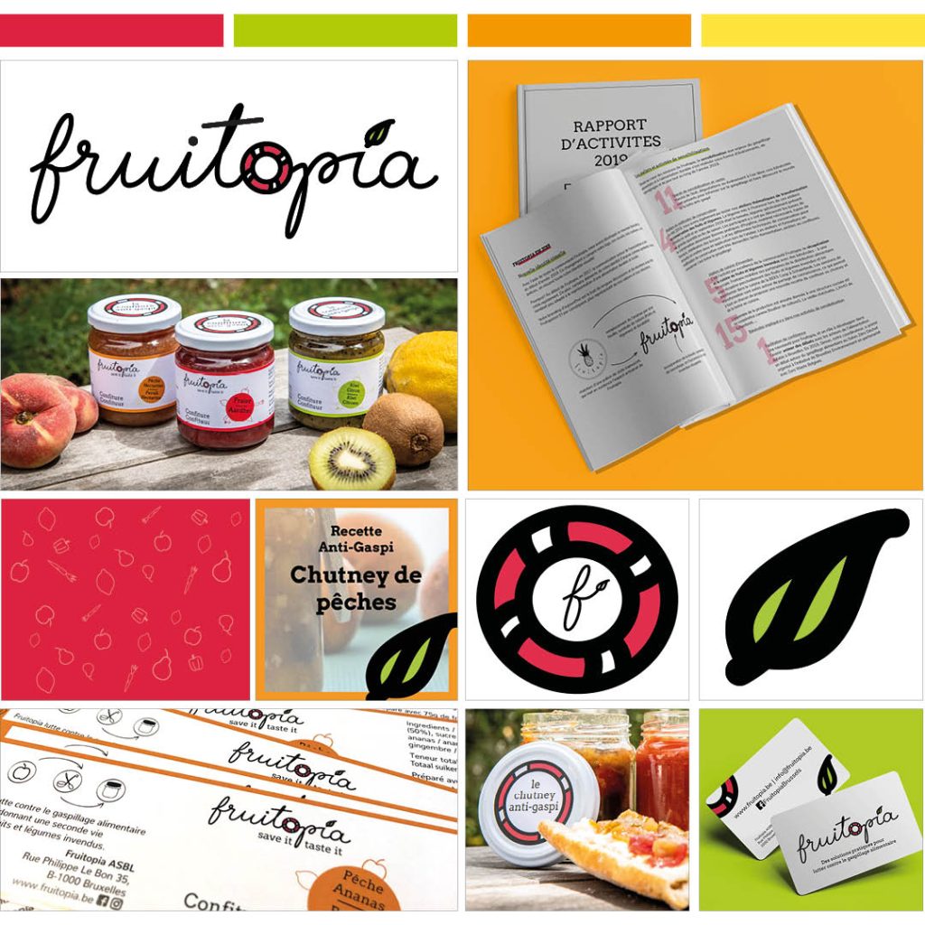
Fruitopia

Fruitopia was a small non-profit association, originally led by a team of very ambitious young volunteers. Their goal was to reduce food waste and they did so by turning “out of shape” fruits and vegetables into long-term conserved goods (jams, chutneys, ketchups) as well as by doing workshops and training people in ways they could reduce food waste – at home or in professional kitchens.
With time their activities grew more important, and it was time to get a brand upgrade. As a volunteer, and later on member of their board, I was very excited to work on their brand identity.
logo design
The idea was to get something that represented
- the artisanal side of the production – still all prepared by hand ! – hence the calligraphied type
- the idea of saving the fruits and veggies and giving them a second life – illustrated by the buoy
- the environmental values behind the organization – a classic leaf symbolising nature
branding
- The palette was composed by vibrant colors to express the dynamic aspect of the organization and remind of the colorful stars: the fruits and veggies!
- Illustrations matched the hand-drawn logotype style
other stuff I did for Fruitopia
- Flyers and posters
- Packaging
- Social media visuals
- Business cards
- Annual report publication
